Rivian - Content design across web, commerce platform, mobile app and in-vehicle
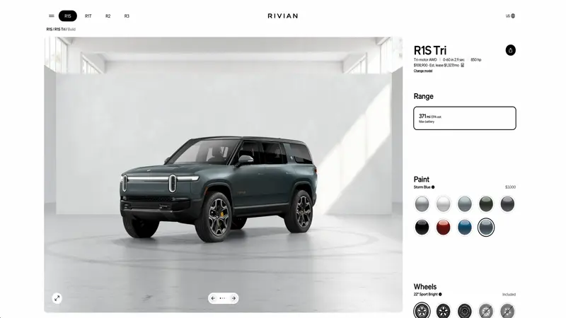
The brief: Build a content design and copy team from the ground up. I’ve been at Rivian for over three years. In that time, I’ve touched everything from the Rivian app and in-vehicle experience to the launch of our newest vehicles, R2 and R3. I’ve refined and iterated flows across the online purchase flow and worked with product designers and engineers to define and build key features from the ground up. Defined voice and tone for our digital products, developed a messaging framework for our app, named more than a few of our products. It’s been a wild ride. This is just a small sample of a few things I’ve worked on.


Mailchimp - Website & campaign
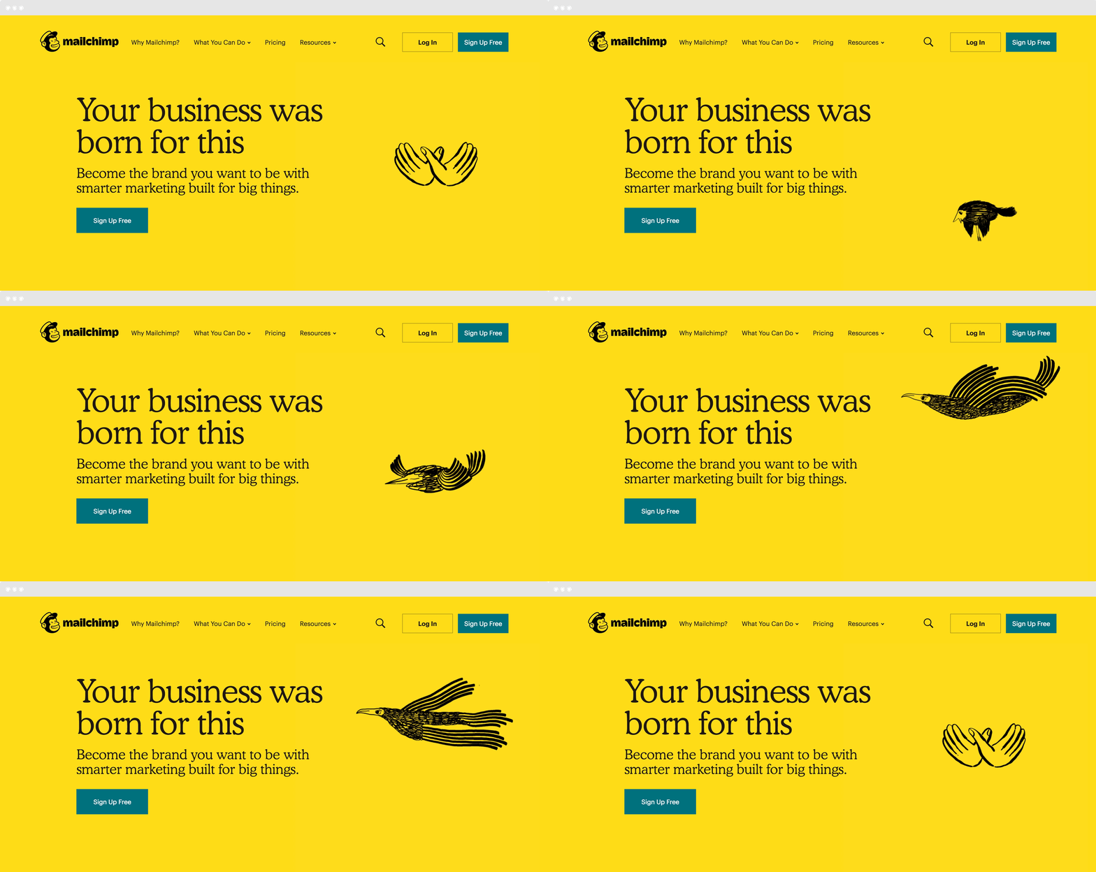
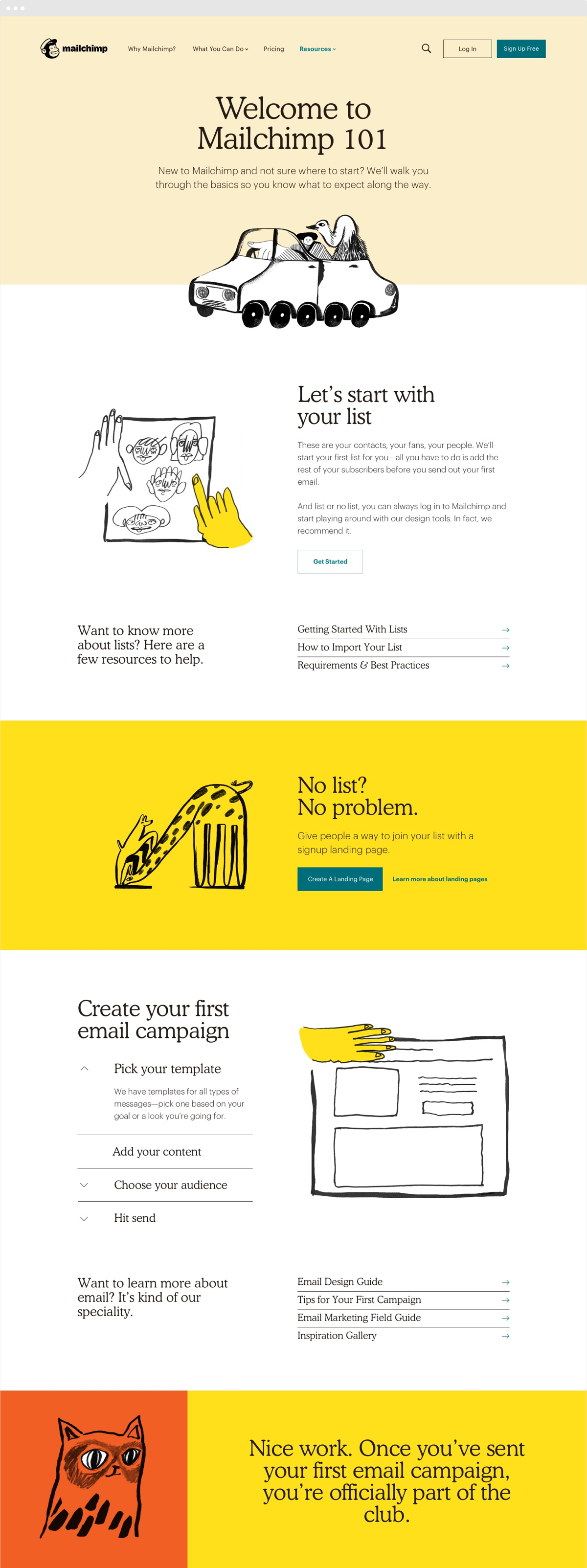
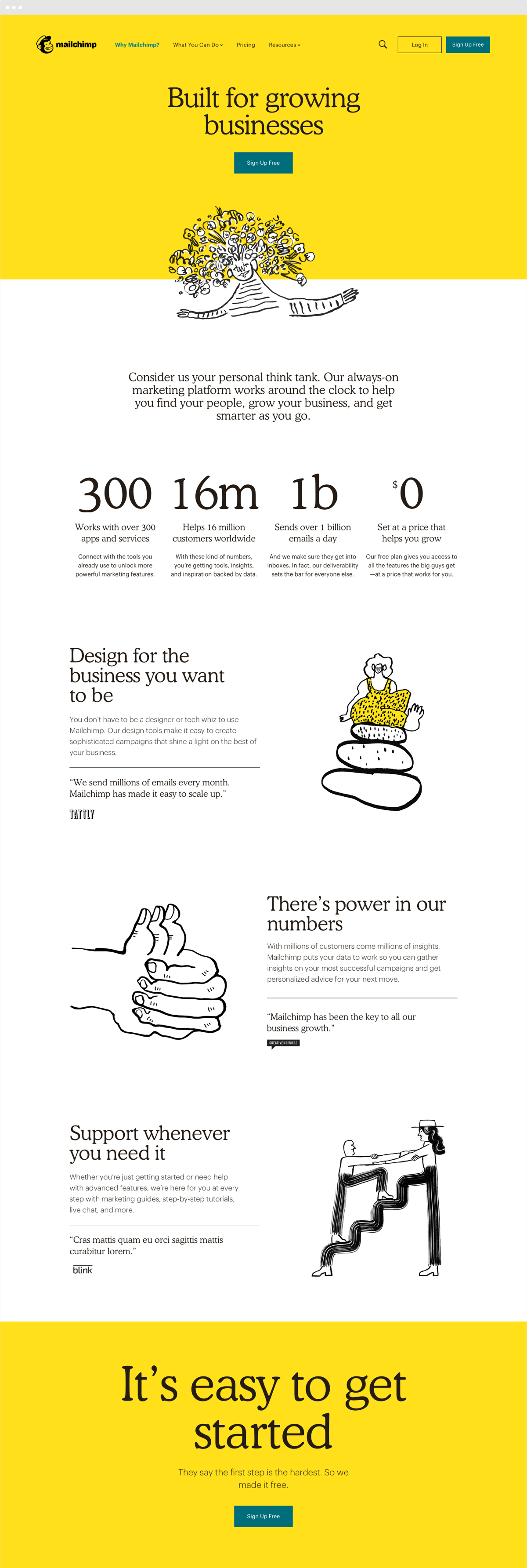
The brief: Redesign Mailchimp.com to show off their new brand and show the world that they do more than mail. I worked closely with our clients, our design team and a team of junior writers to translate their new brand into a new design system (100s of new modules and templates) and a campaign that would tell their product story in a whole new way.


St. Ives - Next Top Scrub microsite
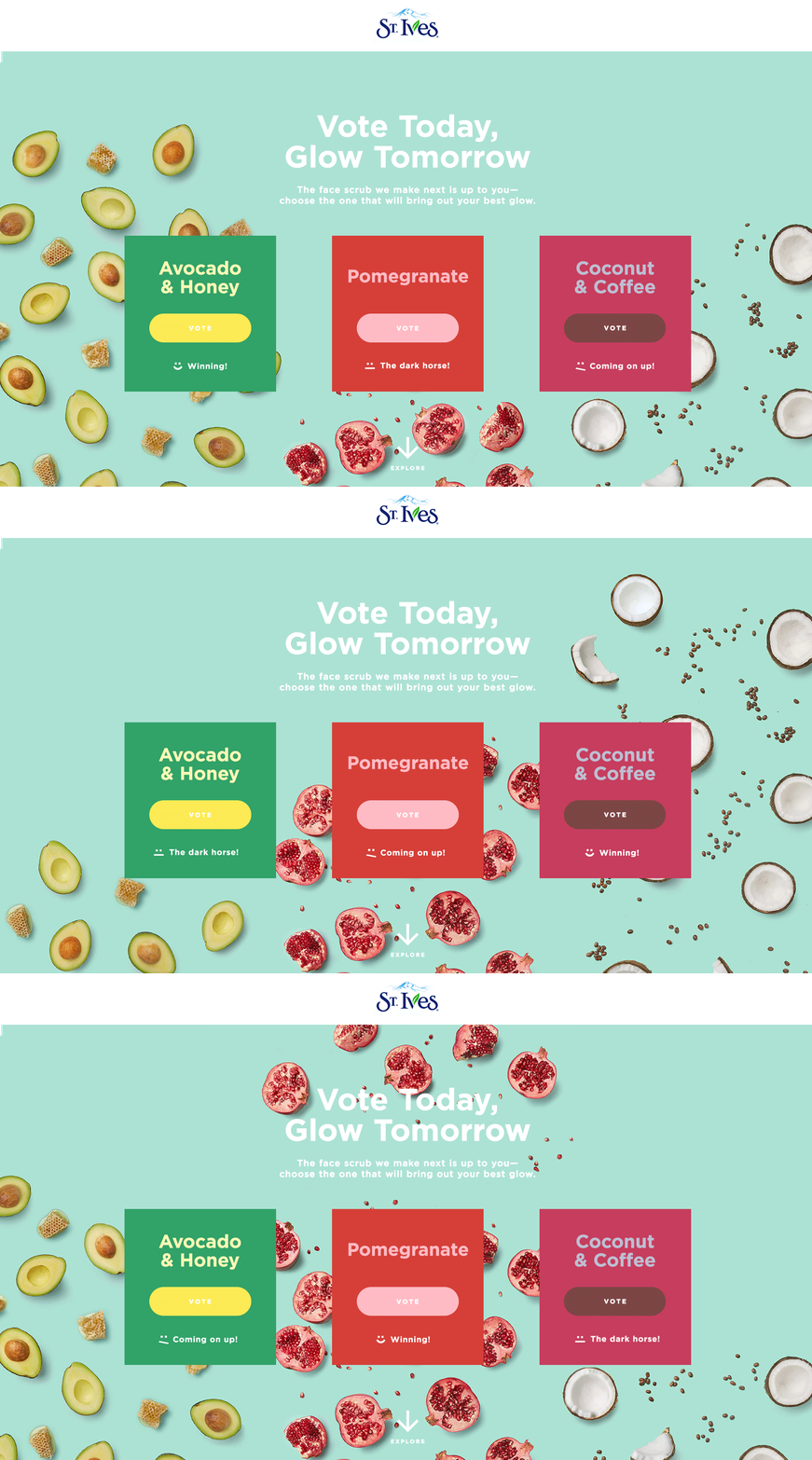
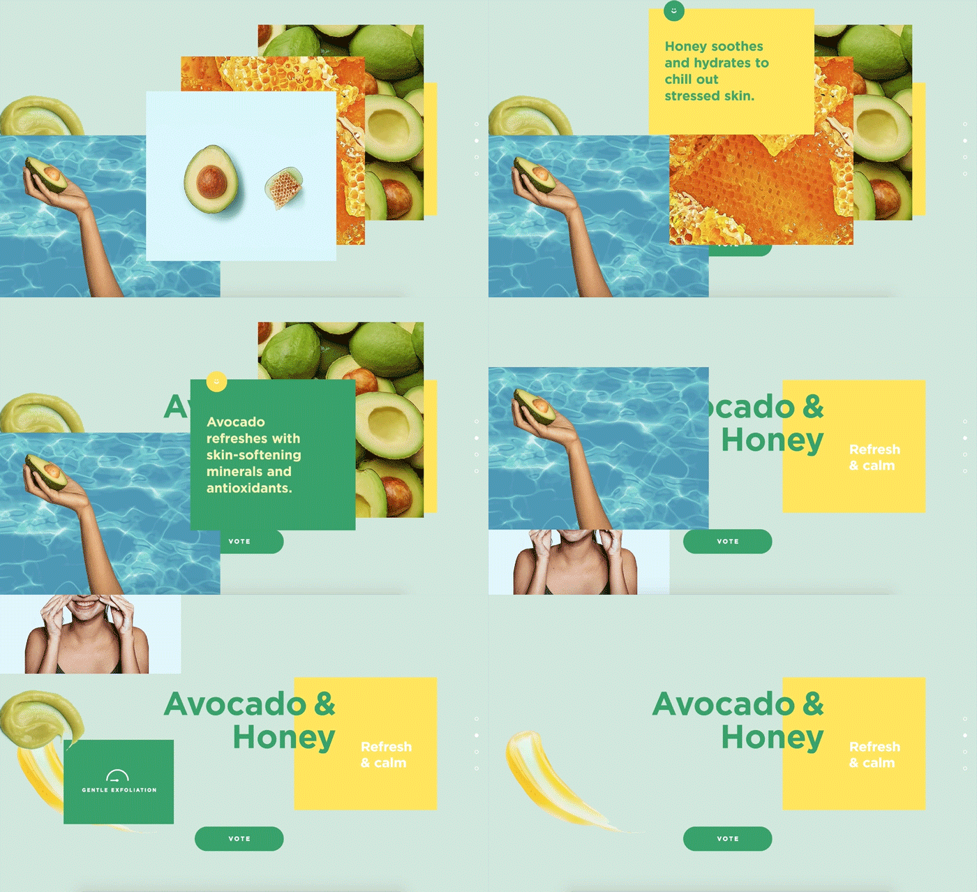
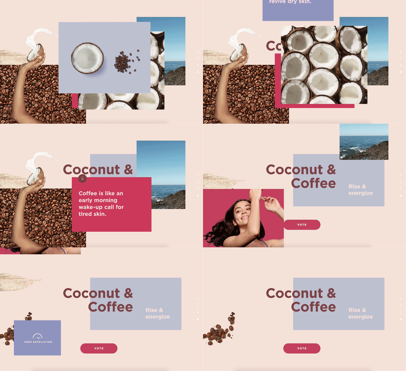
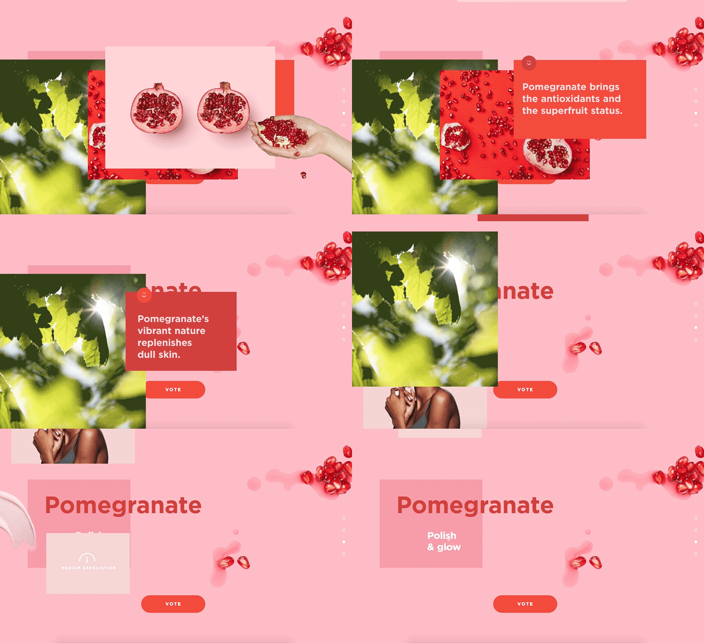
St. Ives wanted fans to pick their next scrub. The challenge? Make crowdsourcing feel fresh. I worked with a team of designers and developers to create a lightweight site that made voting fun. Playful messaging changed dynamically according to the tally and days left for voting. As the user scrolled, the content disappeared layer by layer, for a fun visual play on exfoliation.
St. Ives - Scrubday Instagram campaign
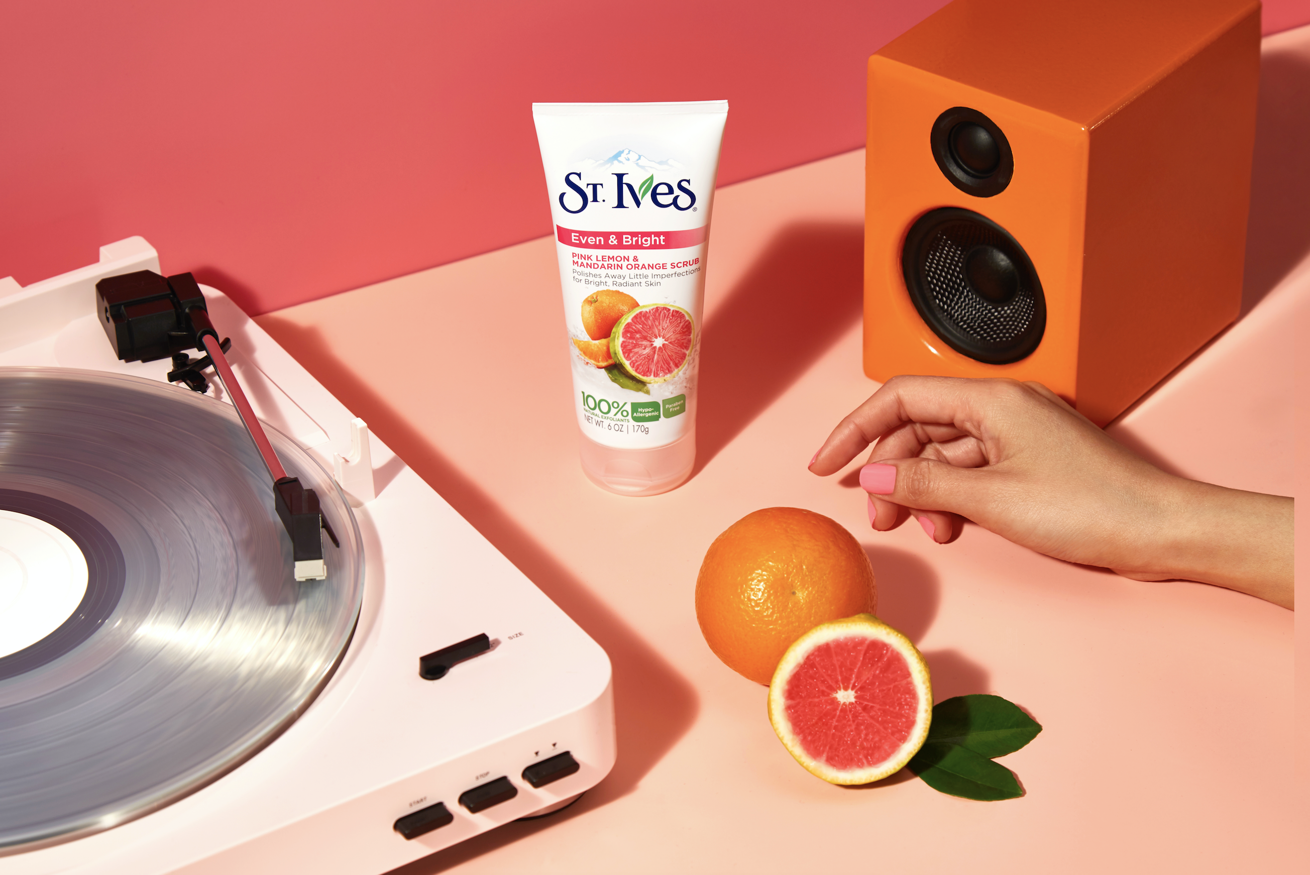
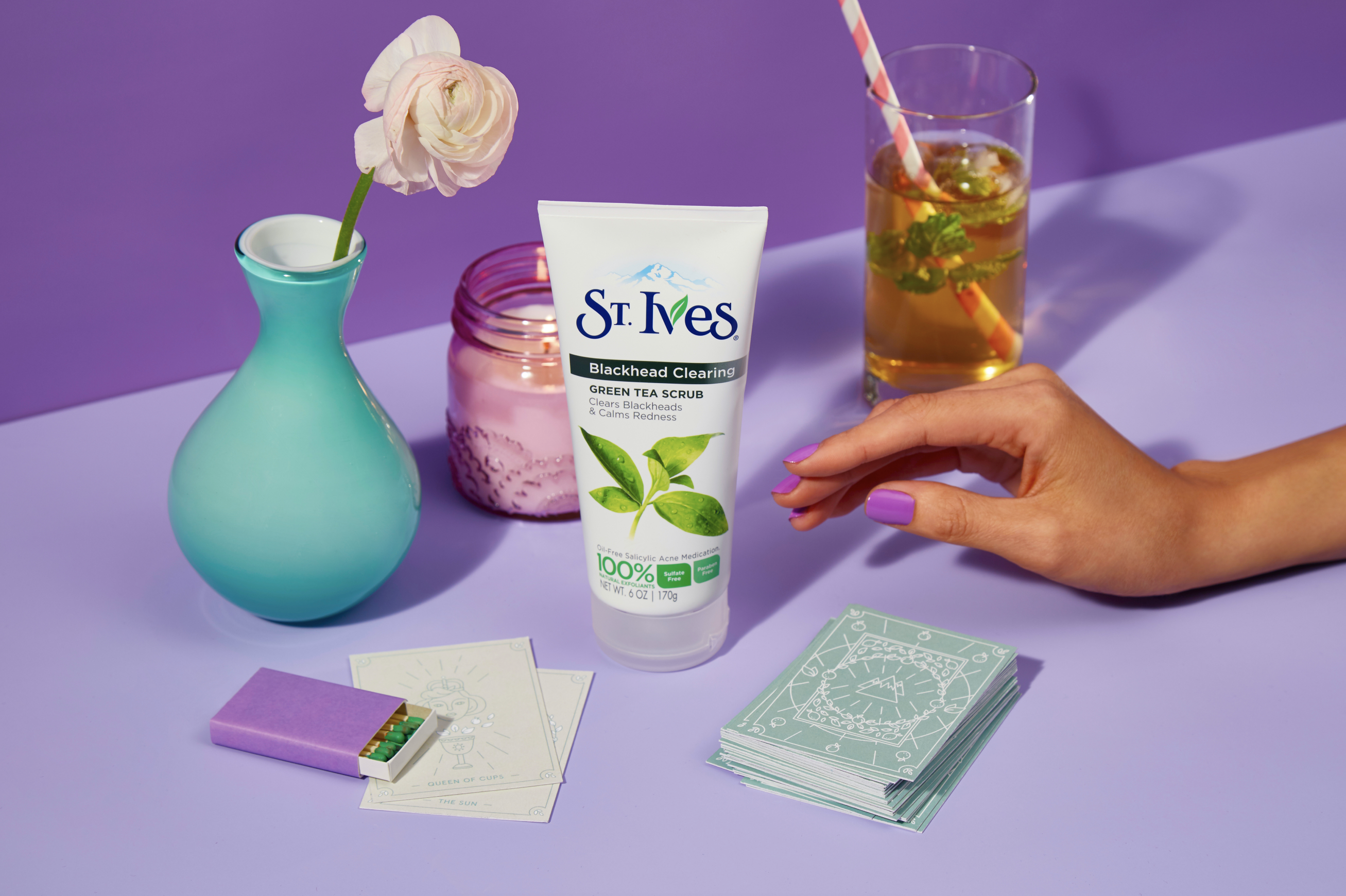
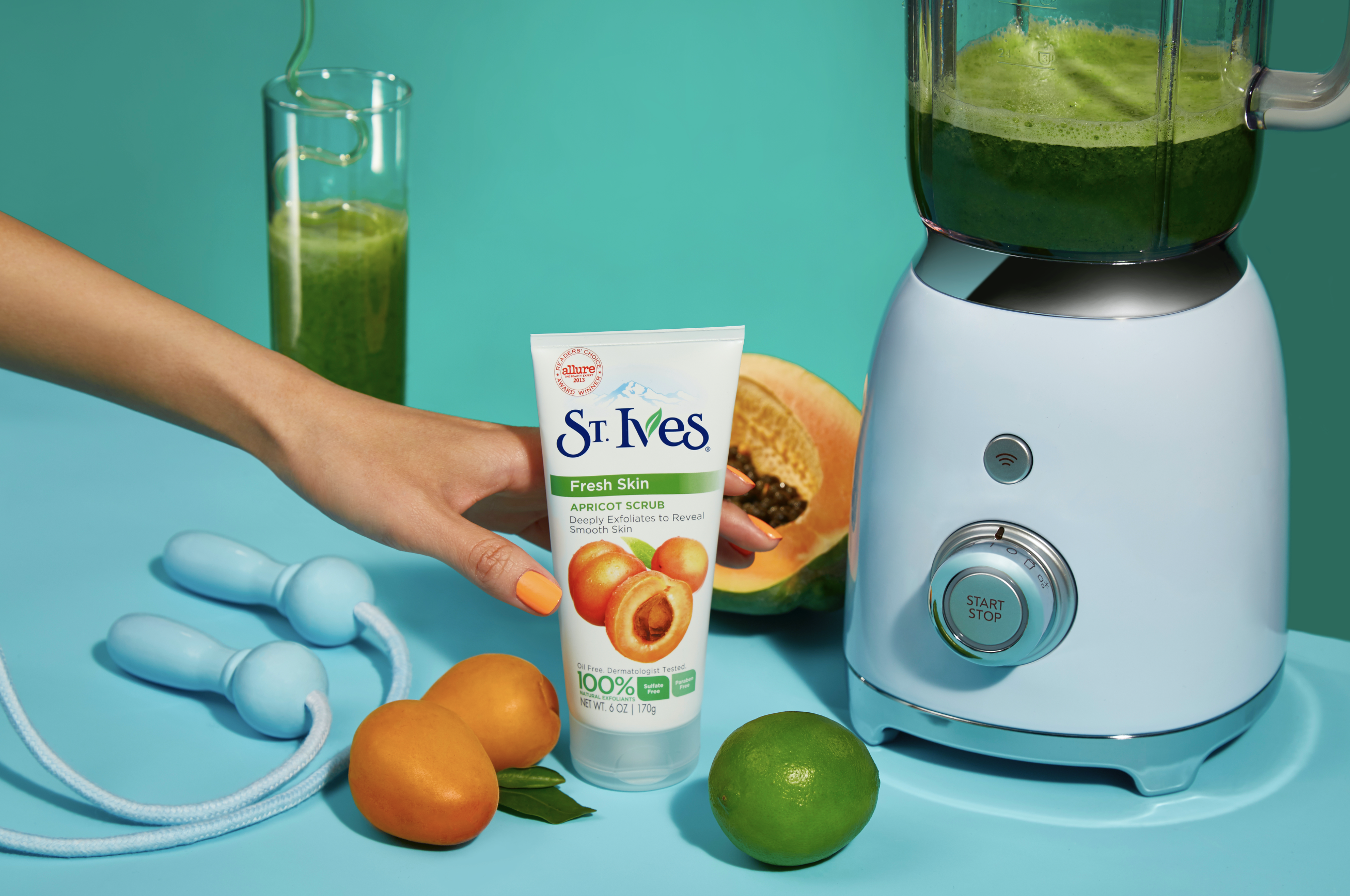
The brief: Bring “scrubday” to life through the rituals that energize you for the week ahead. I worked with a visual designer through initial concepting (really stoked about getting tarot cards in there) to final execution. The final product was three elevated cinemagraphs for Instagram that received comments like, “I love this ad!! Keep making them like this."
Sightworthy - Branding & homepage
Dream project. Working with two amazing female co-founders to define their brand and design a brand and tone of voice system they could bring to life as they continued to grow. I partnered with a visual designer on the brand toolkit and together we designed a home page that would set the foundation for the rest of their site experience as they continue to scale.

Johnson & Johnson - Wisdom by Kids brand & experience
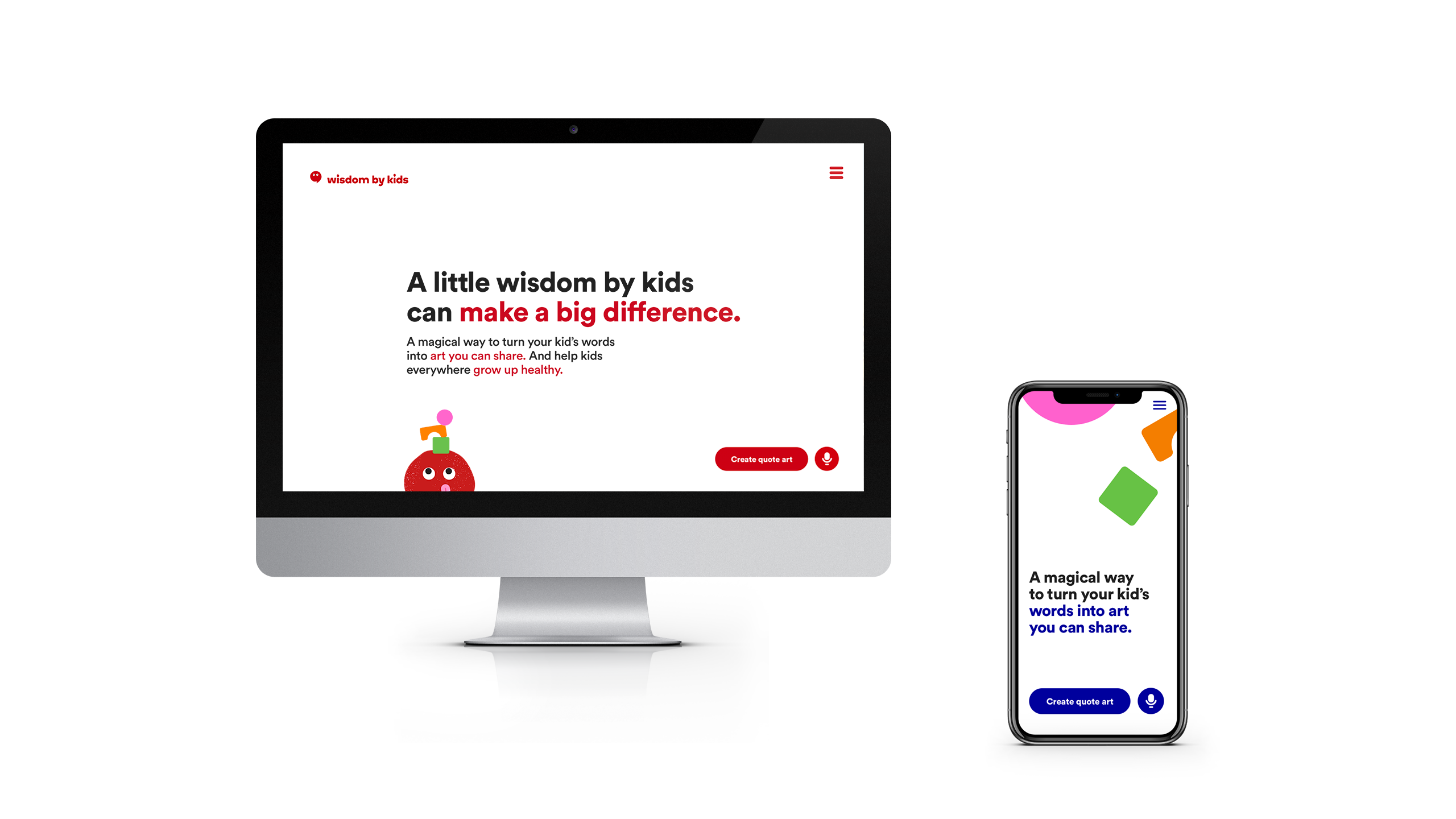
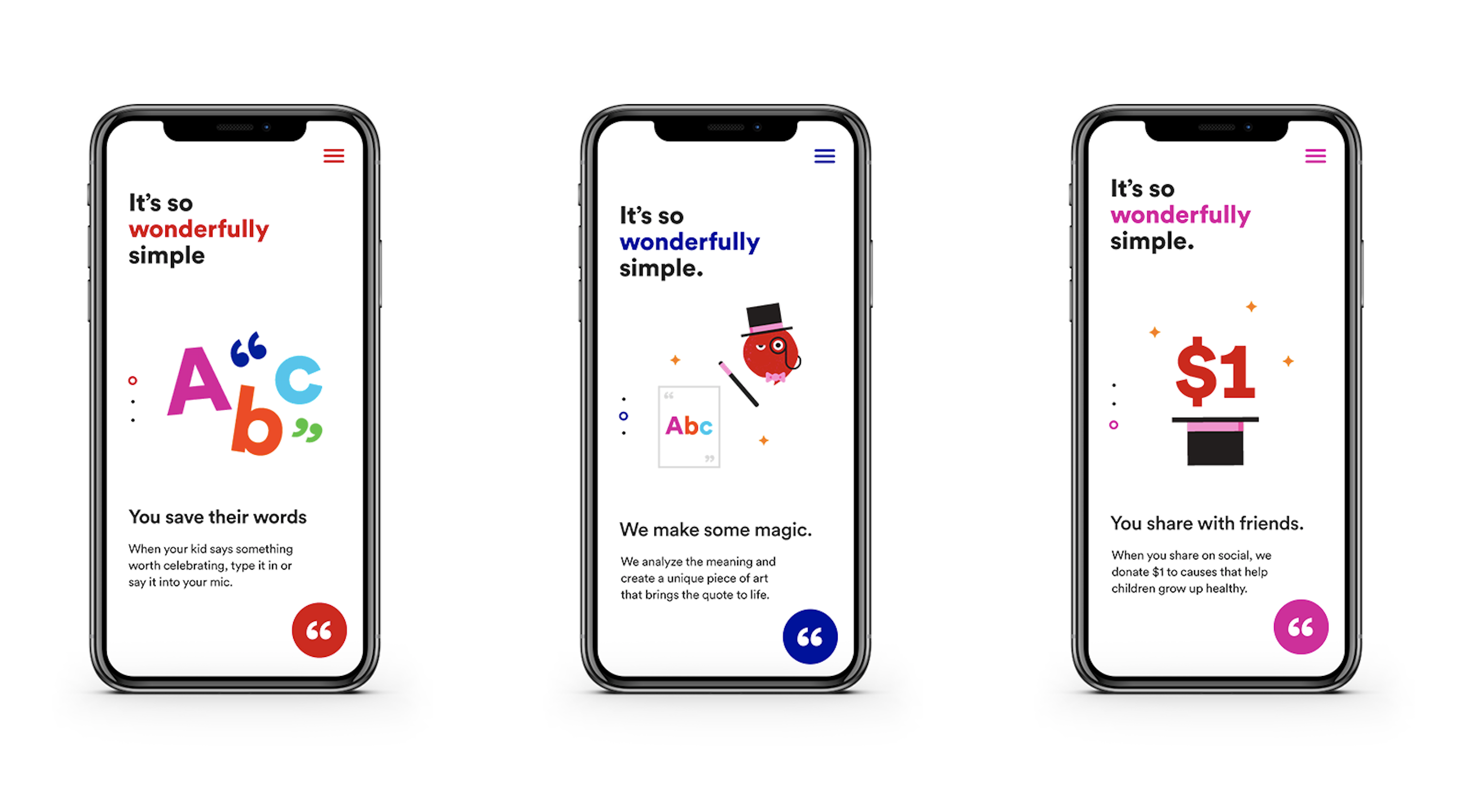
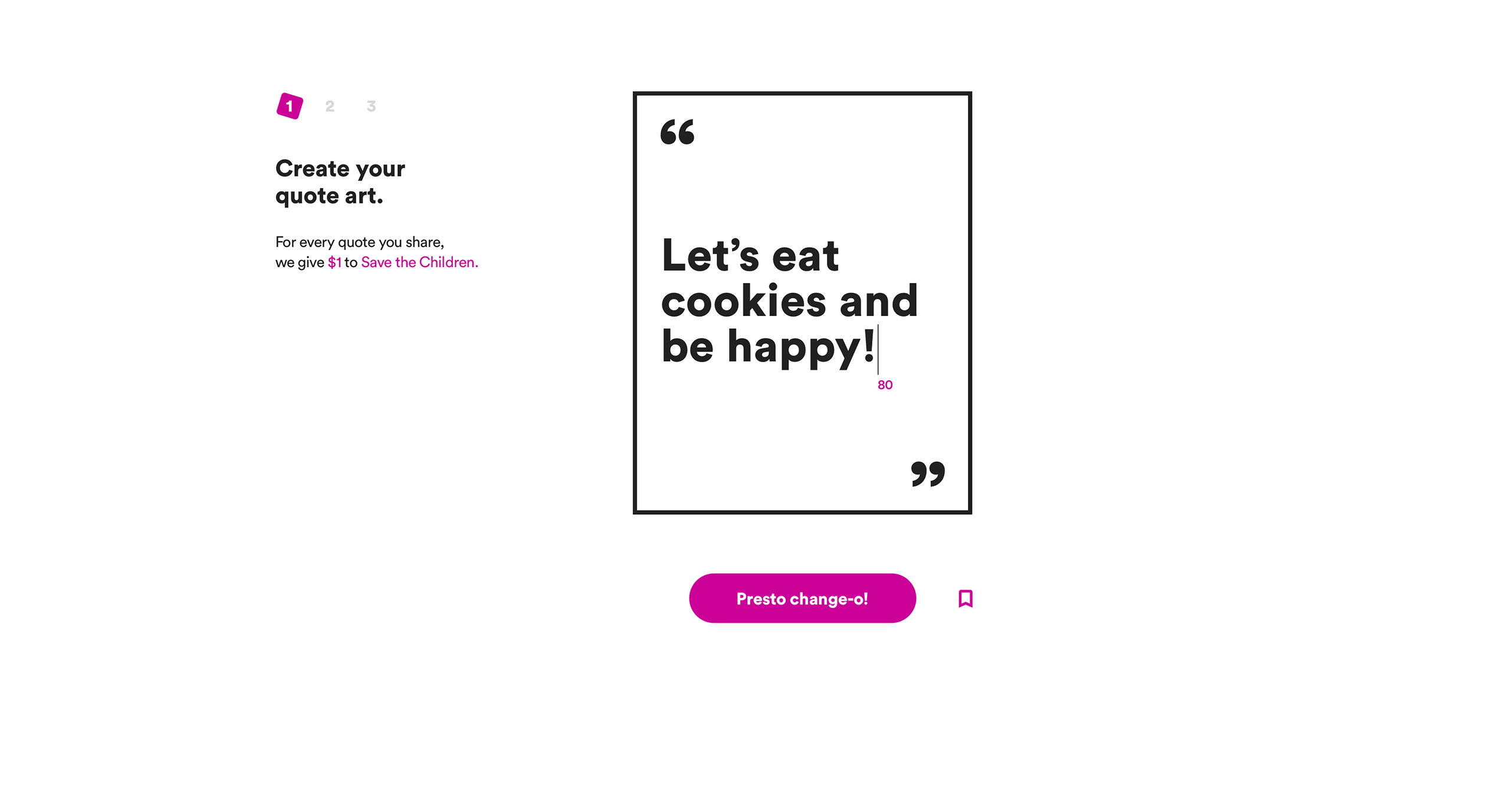
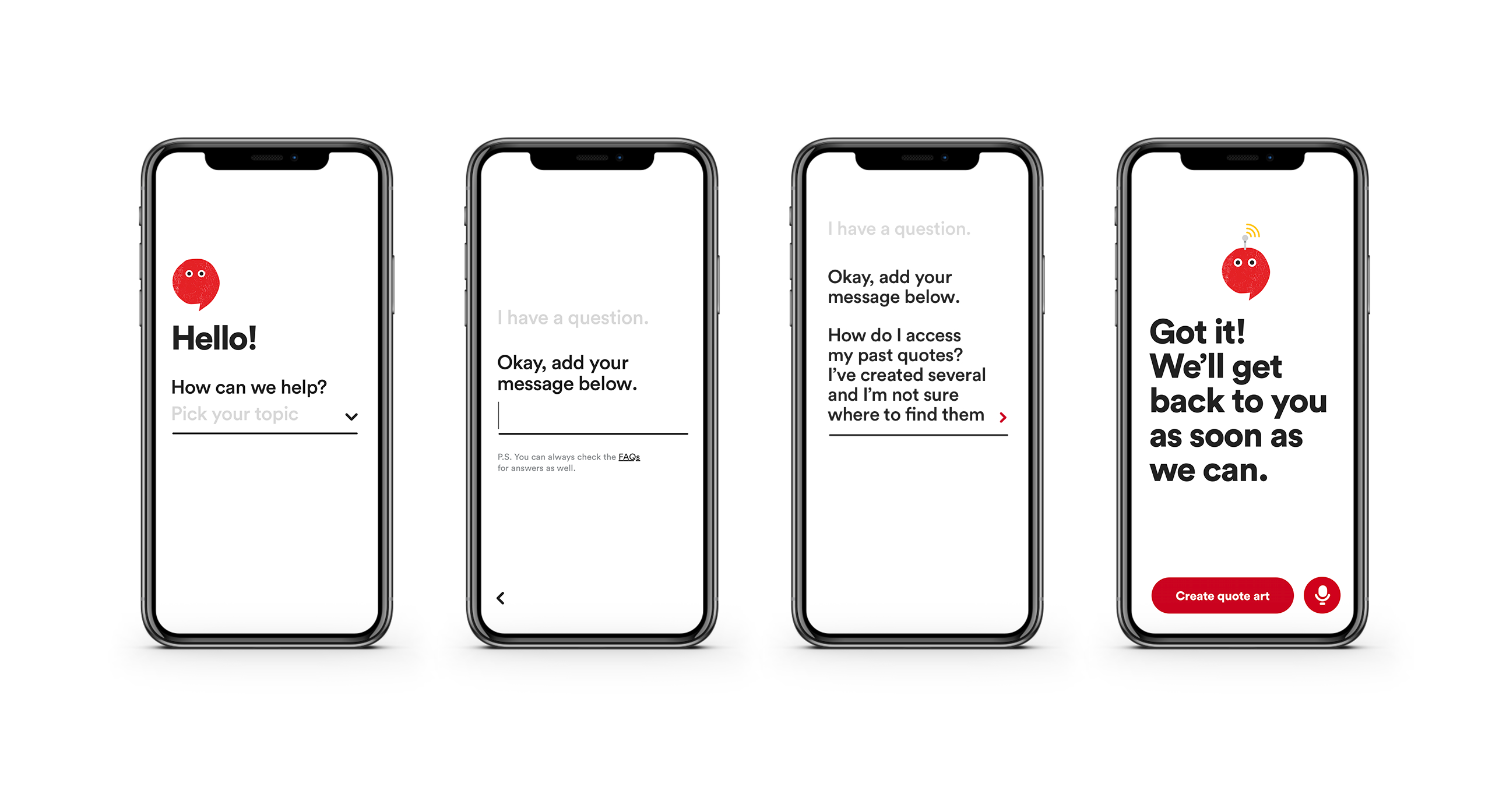
Easily one of the coolest projects I’ve worked on. The concept: Share a kid’s quote and we’ll use AI to analyze and generate a unique piece of quote art. When you share it on social, J&J donates to a cause that helps children grow up healthy. I was involved in everything from naming and TOV, to rules and logic for the quote art generator, to copy for the experience.
Johnson & Johnson - .Baby website & video script
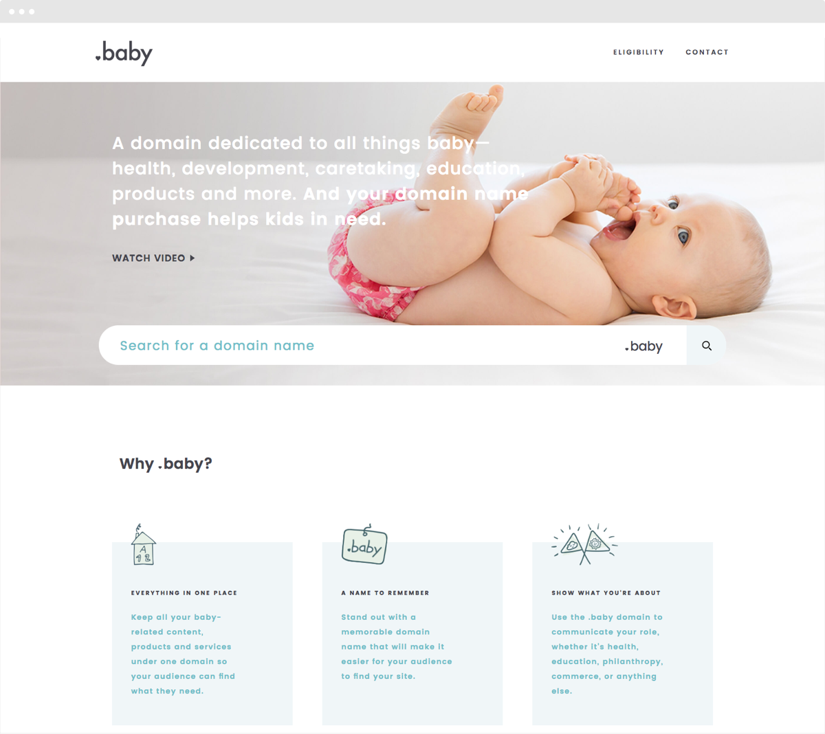
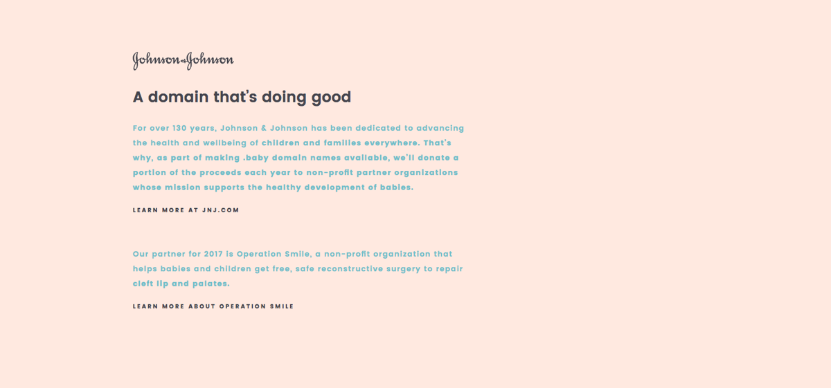
Creating a site for a domain extension was a new challenge. Beyond the initial goal of clearly communicating what .baby is, we needed to highlight the benefits of the .baby domain and why you would want one. In addition to site copy, I wrote a script that was paired with animation and photography to further explain the how and why of the .baby domain.
Nike - Women's Training Shoes landing page
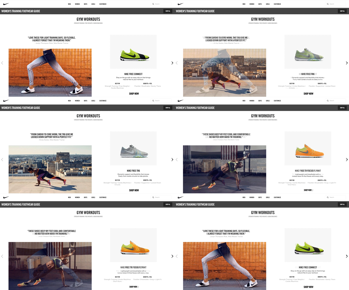
The brief was to create a landing page for women’s training shoes. But a quick survey revealed a surprising insight. Women weren’t buying training shoes because they didn’t see themselves as “training”. In response, we tackled the page workout-first, categorizing shoes by activity and leading with educational copy and video to show how training shoes can step up any workout.

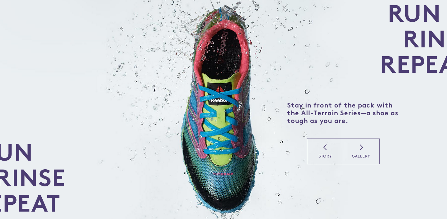
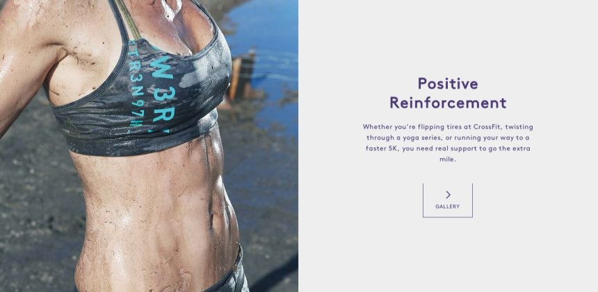
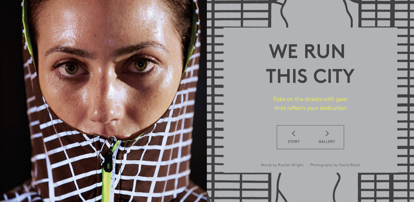
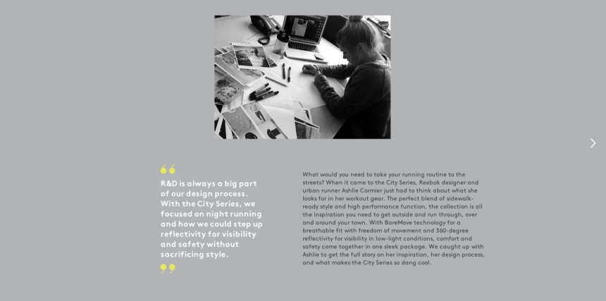
Reebok - Rally - Print & digital
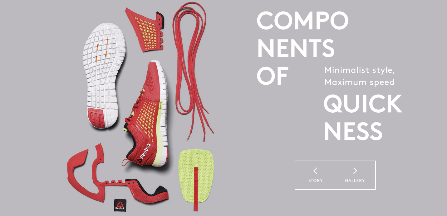
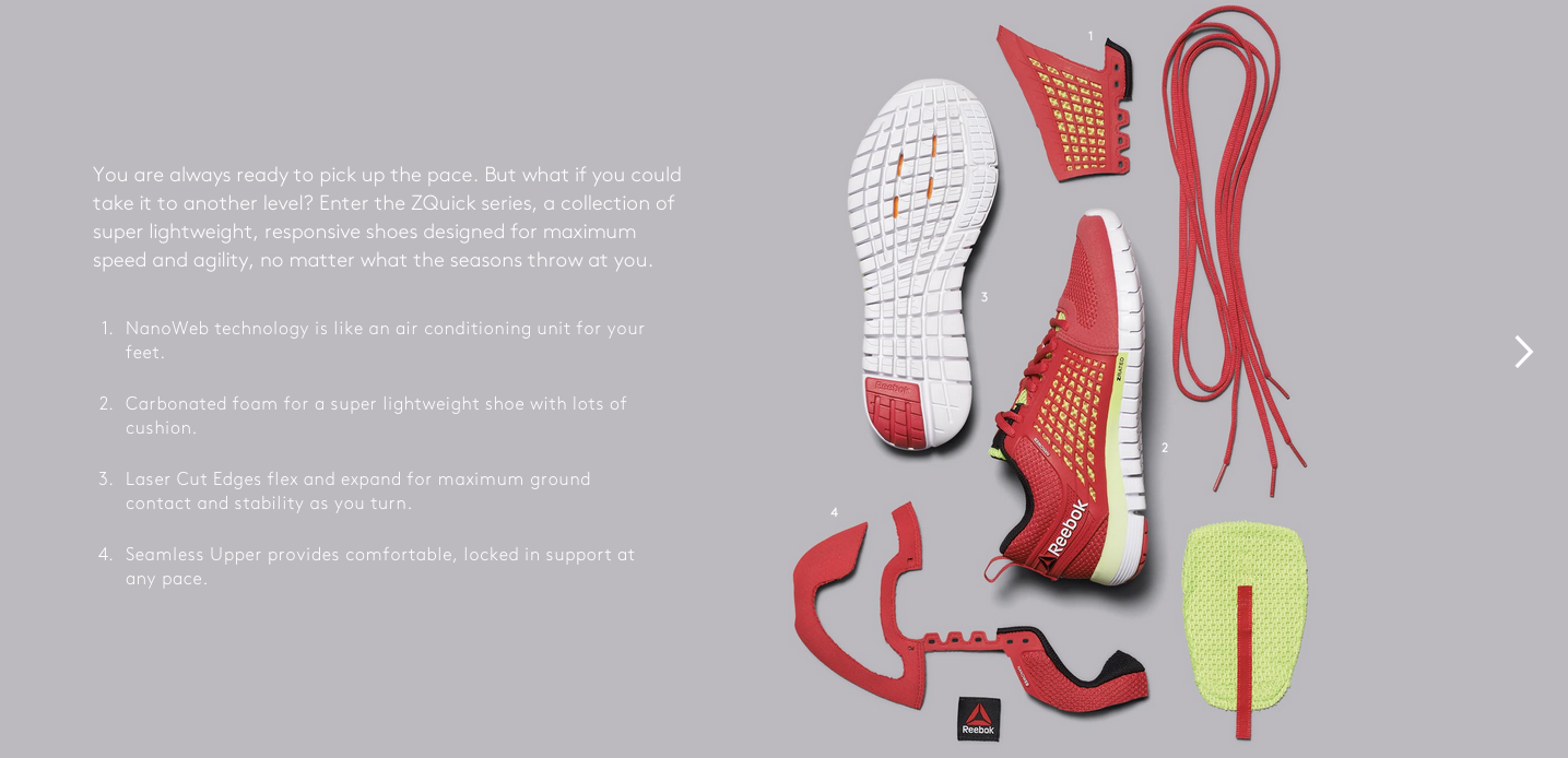
Half magazine-half catalog, Reebok’s Rally inspires female athletes with stories that combine fitness and style. I was brought on for Vol 2, the fall/winter issue. Striking a balance between branded and editorial, I wrote everything from bold headlines to behind-the-scenes product stories to a profile on Laure Manaudou, Reebok athlete and former Olympic swimmer.
Owners.com - Branding & website
The brief? Create the first online platform for buying and selling homes from the brand foundation up. I worked closely with a team of visual and ux designers to bring the online real estate experience to life—from sign in to search to closing the deal. This project was a great mix of empowering brand messaging and functional systematic copy in that warm, guiding tone.


